Elden Ring Redesign
What Tool?
This project was made using Figma.
Length of Project?
This project took me a total of 1 month to make.
A Basic Summary
For my UX II class, I was instructed to go through a process of improving upon an existing menu through multiple rounds of interviews, a rough draft wireframe, and then a final wireframe that shows off a major design change.
Lessons I Learned
UX research, stakeholder interviews, wireframe building.
Solo or Team?
I worked on this as a solo project.
Sole UX Designer?
With me working solo on this project, I was also the sole UX designer.
Highlighs/Constraints
Constraint
One of the largest constraints I had to design around in this project was the professor's request for a major pivot that altered the design of our UI.
Highlight
My highlight of this project was the solution for the pivot, as I ended up adding in a "paper doll" to the equipment screen that both preserved and heightened the original concept that I made.


Planning

Ideation
I had played through Elden Ring the summer before class began, and so for a while, I was already wanting to improve what felt like a lacking user experience with those menus.

Setting the Rules
For this class, we needed to interview 10 people, followed by another 3, and use that data to create problem and solution statements.
Interviewing
Audience Interviews
Before I could make any UI, I needed to interview 10 people to find the audience's issues. I simply asked "What did you like?" and "What did you not like?" and let them ramble.

User Statements
From that, I read and highlighted all the important information, then condensed it into a single sentence. These "user statements" would help with creating solutions to these issues.
Stakeholder Interviews
After the original interviews were done, I then coded everything, highlighting 2 main issues with the UI that united every user. Using those, I then did 3 more larger interviews.
The Rough Draft
Problems and Solutions
I was able to create a set of actionable problem and solution statements, which help to guide the process of fixing a user experience issue.
Creating the Wireframe
With all my data prepared, I now had the pieces I needed to make a proper, informed user interface that solved most of the issues that players had with the original UI.

Some Thoughts
While I think it improved on the original, several issues could've been improved on. These include: information too far from the cursor, as well as a less elegant look to the UI.
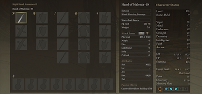
Pivoting the Design
The Pivot
Our professor asked us to make a major design pivot to this project, meaning that I not only had to iterate on the rough draft, but also add something brand new.

The Decision
After some thought, I finally decided that a paper doll would be the best change to make, as it allowed for the player to see their weapon and armor changes directly.
Info Redistribution
The reason this ended up working so well was due to the information being moved around. Attack-related things were put on the left, while magic and armor were on the right.
Final Product and Conclusion
Conclusion
These are the rough and final drafts compared against each other.
Overall, I learned a ton from this project, not only as a UX designer but also in the overall design process. Everything from interviewing and creating solutions, to quickly dealing with design pivots and still meaningfully iterating on the original design.
I'm excited to continue working on improving UI like this, and can't wait to use these skills to build my own UI pages.